
Fonts aren't exactly the first thing you think about when updating your resume.
At first glance, resume fonts might seem like a small detail. Something that you choose quickly and move on from. But typography is much more than that. It’s a tool for communication, a way to express professionalism, and even a subtle cue that influences subconscious perceptions.
In tech, clarity is everything. Your resume should reflect that.
If it’s hard to scan or doesn’t play well with Applicant Tracking Systems (ATS), you’ve lost even before the real content has a chance. You don’t need to obsess over typography. But you do need to get it right.
Then what is the best font for resumes in 2025? Let’s walk through how to pick a font for resume that works: for humans and machines alike.
The Psychology Behind Resume Fonts
Before we dive into the list of best resume fonts and size recommendations, let’s take a moment to understand why font choice matters.
Recruiters often skim resumes in seconds, and clean, legible fonts help ensure your skills don’t get lost in the formatting. A cluttered or outdated font can distract from the content and potentially hurt your chances.
 Recruiters form opinions about your resume in just 6-7 seconds. Fonts play a big role in shaping those initial impressions.
First Impressions Happen Fast; Really Fast
Imagine this: a recruiter opens your resume. They haven’t read a single word, but their brain is already making judgments.
Your font choice sets the tone before a word is read. It can signal professionalism, clarity, or even confusion, depending on what you chose.
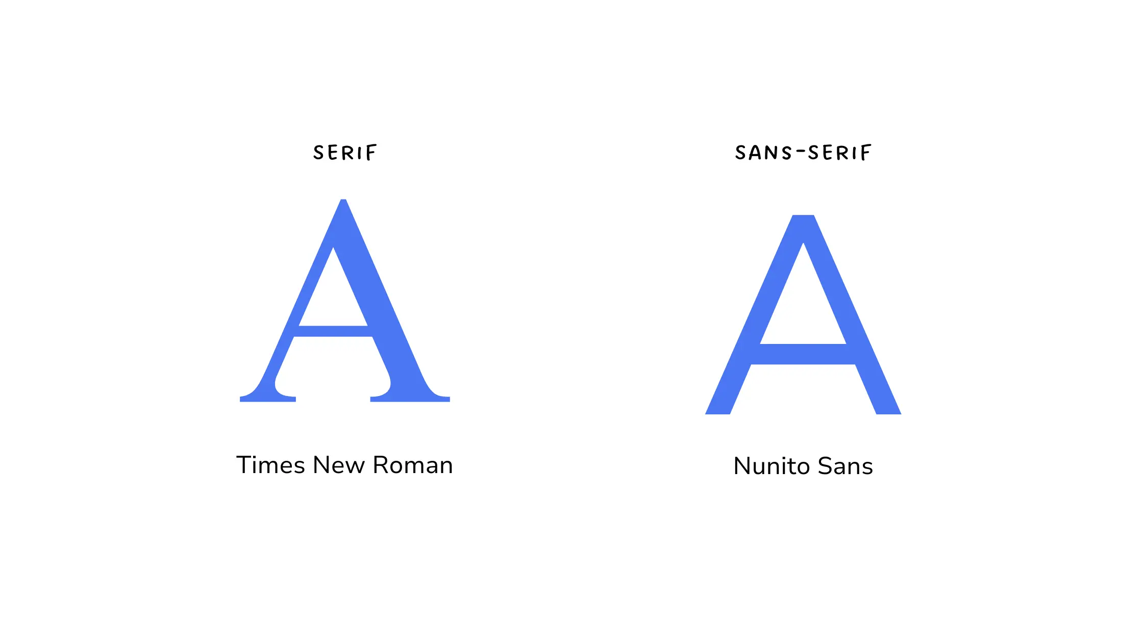
Serif vs Sans-Serif: Pick Your Personality
When choosing the best resume font, it helps to understand what your font says about you.
Serif fonts like Georgia or Cambria come with little “feet” at the ends of letters. They feel formal and trustworthy, making them a good fit for conservative industries like finance, law, or academia.
On the other hand, sans-serif fonts like Roboto or Open Sans are clean, modern, and highly readable on screens, making them a smart choice in a world where resumes are rarely printed.
If you’re looking for the best resume font for tech jobs, picking a readable resume font, especially one optimized for screens, can give you an edge. Hence, sans-serif wins.
 Different fonts convey different messages. Choosing the right one helps align your resume with the expectations of your target industry
When we asked Professor Gerry Leonidas, Professor of Typography at University of Reading, about serif vs sans-serif fonts for resumes, he shared:
"It doesn’t matter much, as long as the typeface is designed for the range of rendering environments. An older style serif will not be pleasant on a high-res screen, whereas a serif typeface with lower contrast can work well on a laptop, tablet, or printout.
What matters more is the weight difference between the styles used for headings and text. Sans serifs tend to offer greater flexibility in this, so can fine tune the typography more easily. On the other hand, serif typefaces tend to have more distinctive italics, so if the content needs to include this kind of emphasis, a robust serif typeface may work better."
Fonts Matter More Than You Think
Here’s a simple experiment. Take two resumes. Same content. Same layout. No fancy design.
Now change just one thing: the font.
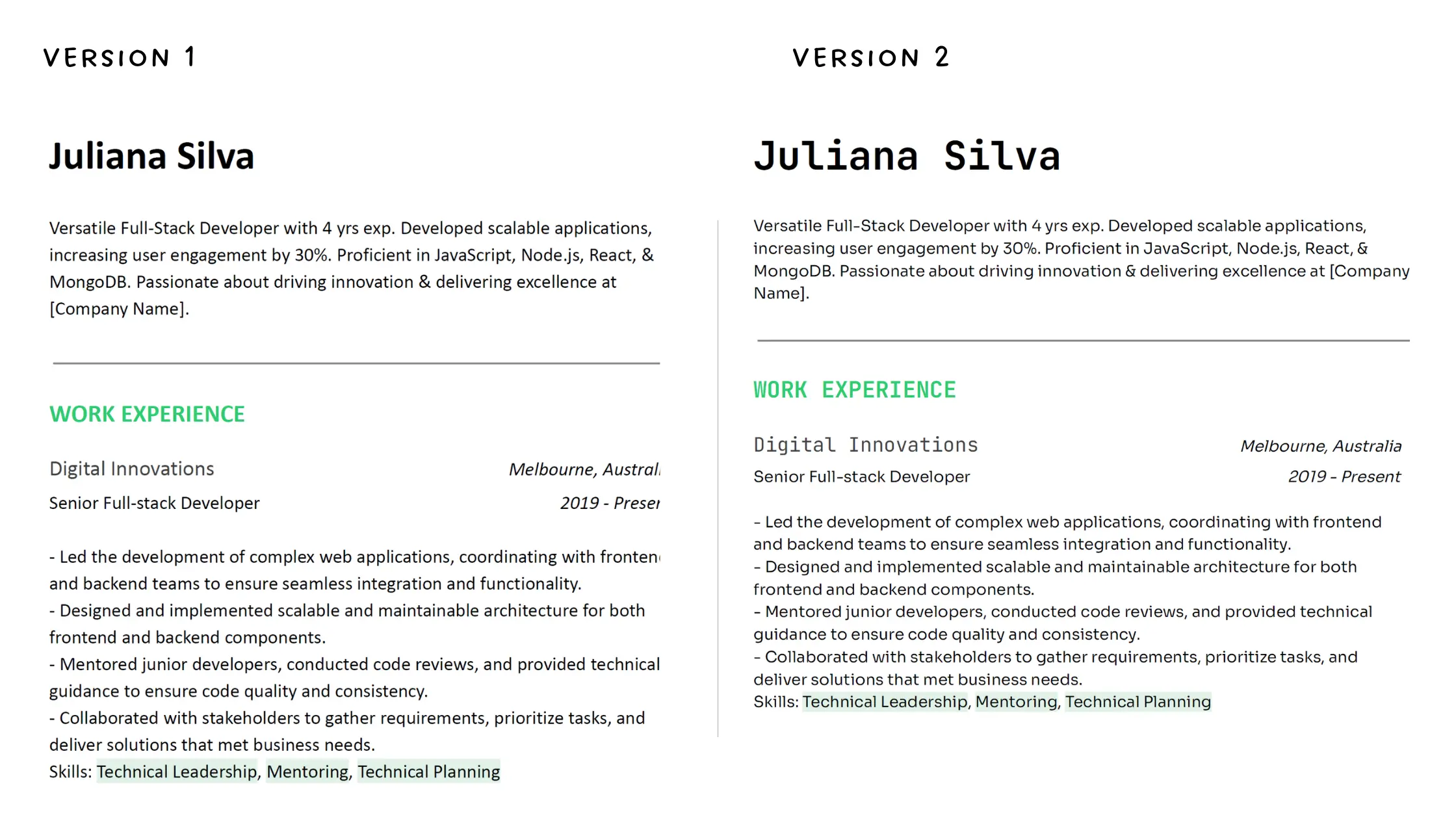 A well-chosen font ensures your content is easy to read across devices and formats, keeping recruiters engaged longer.
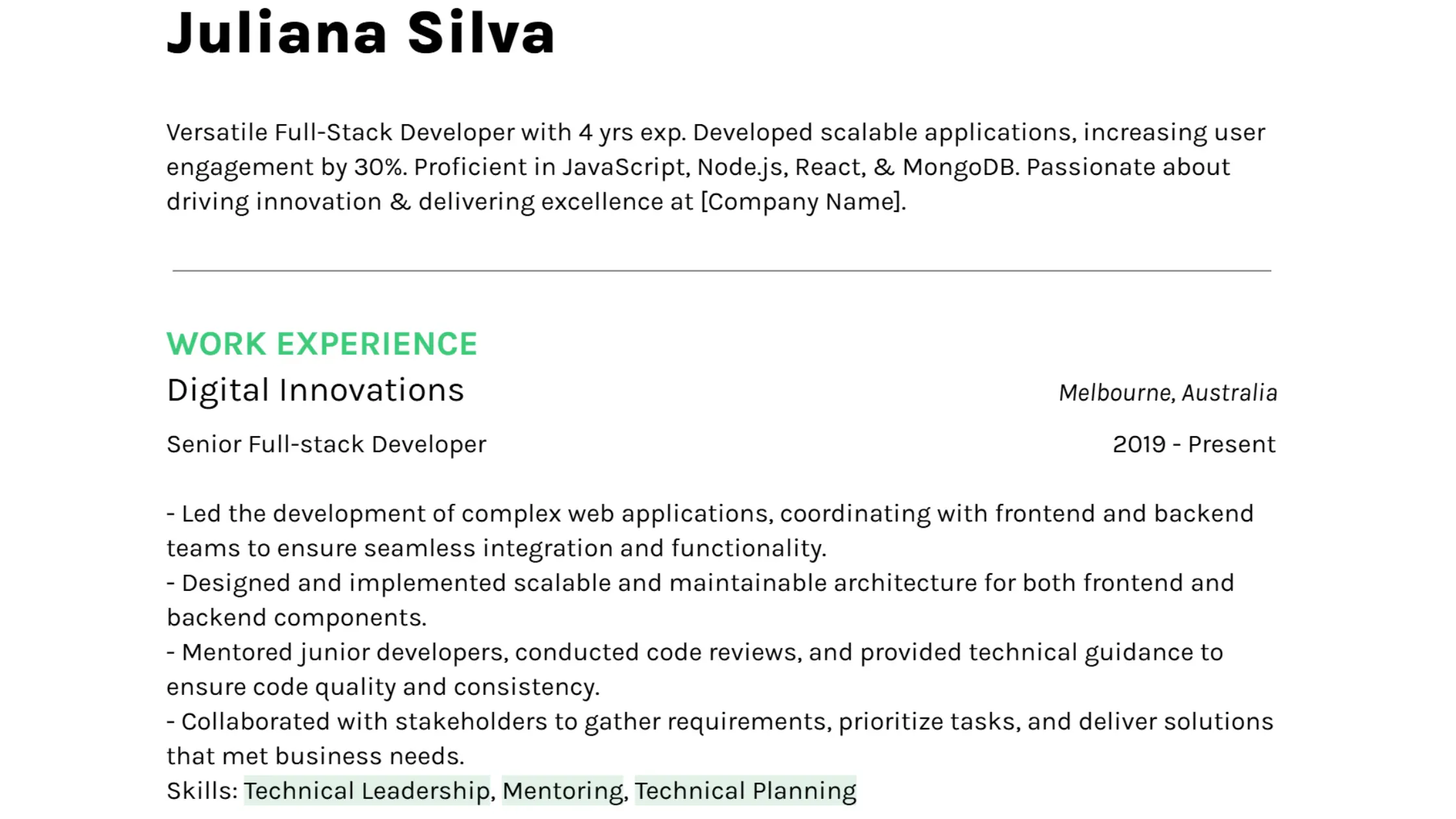
- Version 1 uses Calibri: the safe, default choice.
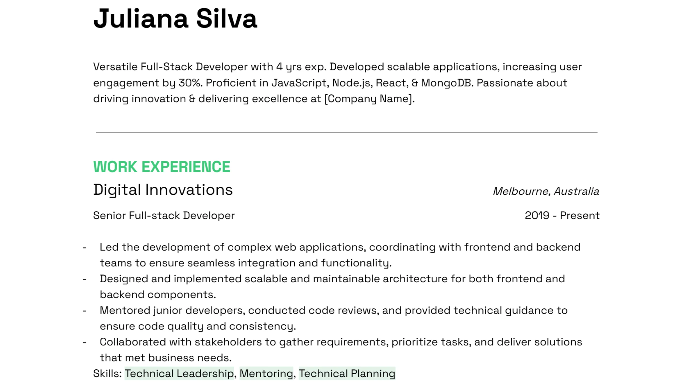
- Version 2 uses a modern pairing: JetBrains Mono for headings and Sora for body text.
You’d be surprised how different they feel.
The Calibri version looks familiar but also very forgettable. The second version has character and feels thoughtful, like the person behind it knows what they’re doing.
That’s what the best resume fonts do. They don’t just look good.
Fonts instantly change the tone of your resume, even before a single word is read. Tech hiring is detail-driven. A messy layout or hard-to-read font can cost you the interview, even if your skills are solid. So it is important to have a suitable font for resume.
Why Fonts Matter More for Tech Resumes
-
Digital-first reading: Most resumes are viewed on screens, so choosing a font that looks sharp on devices is crucial. Fonts like Open Sans or Helvetica stay clear and easy to read, even on small screens, making them perfect for tech resumes in 2025.
-
ATS compatibility: When applying for tech jobs, you need to ensure your resume gets parsed correctly by Applicant Tracking Systems (ATS). Fonts like Nunito Sans and Karla ensure ATS-friendly formatting while still maintaining a sleek, modern look.
-
Minimalist aesthetic: Tech resumes thrive on clarity and simplicity. Fonts like Roboto, Inter or Montserrat work seamlessly with minimal layouts and plenty of white space, conveying professionalism without distraction.
Also remember to preview your resume on different devices. What looks great on your laptop might look cramped on a phone. Make sure your font holds up.
Expert Insights: Decoding Resume Fonts with Professor Gerry Leonidas
We spoke with Professor Gerry Leonidas, a leading expert in typography and Professor of Typography at University of Reading, to understand how font choices can impact your tech job application. Here's what he had to say:
1. Given the prevalence of digital screening in tech recruitment, how much does font and typography actually influence whether a resume gets shortlisted, or is it mostly a ‘nice-to-have’ detail?
It depends on the industry, the number of applicants, and the level of the position. In some sectors – especially when HR departments are screening CVs before they get reviewed by hiring teams – standard conventions about structure and appearance seem to be critical. This is more so as some agencies are using AI tools to screen CVs. In those cases the font itself doesn’t matter, since the system only reads the Unicode values, but the exact characters and sequence of elements can condemn an otherwise great CV. What is “legible to an AI system” is not widely understood yet.
Once a CV is filtered through to a hiring team that understands the discipline, typographic clarity is paramount. This is more about visual hierarchies and editorial decisions than the font, which ideally is discreetly chosen to be efficient in the genre, while also showing that the CV author has made a conscious choice.
Key Takeaway for Tech Professionals: While ATS might not care about the specific font, ensure your resume's structure and formatting are clean and standard to avoid misinterpretation by these systems. Once a human reads it, clear visual hierarchy is key to highlighting your technical skills and experience effectively.
2. What are the best ways to use typography to make important information stand out in a dense text-heavy resume?
Don’t make it dense and text-heavy! I’ve seen too many CVs that repeat information in different sections, and give too much information for the decision that needs to be made. The more stuff you have to put on the CV, the more you need to zoom out and describe your experience thematically.
Clear headings that are descriptive, avoiding excessive details, and good visual separation of sections. Spacing should enable the reader to read at heading level only, or dive deeper. The typeface needs to work well with two levels of visual hierarchy (either within the same type family, or with one family for the text and one for the headings) without drawing too much attention to itself – but showing that the document is considered in all its aspects.
I’d look for excellent spacing, modest capital size and weight in relation to lowercase, and numerals / non-alphabetics that are designed to work well with CVs.
Key Takeaway for Tech Professionals: For tech resumes often filled with projects and skills, prioritize conciseness and clear headings to allow recruiters to quickly identify key qualifications. Strategic use of bolding (within a legible font family) can also highlight crucial technical skills or accomplishments. Look for fonts with excellent spacing and balanced letter sizes for optimal readability.
3. What do you think of system fonts like Calibri or Times New Roman — safe bet or outdated?
I’d never, ever use Times for anything. It is really not suitable for digital environments, its design is not calibrated for high-res screens and current reader demographics. It suggests not only that the author doesn’t understand how to make the CV easy to read, but also is completely out of tune with even the most basic defaults for contemporary reading. Really, the sooner we see Times disappear from our documents the better.
Calibri is the meh default: it works if you don’t want to use hierarchy with any refinement (the bold is excessively heavy for a CV), but your document will look like you haven’t really made the effort. It will look like any school report made in Office.
Key Takeaway for Tech Professionals: Avoid Times New Roman entirely; it can appear outdated on modern digital screens used by tech recruiters. While Calibri is acceptable, choosing a more deliberate and refined font can signal attention to detail, a valuable trait in the tech industry.
Best Resume Fonts in 2025 (And Why They Work So Well)
If you're wondering what is the best font for resumes, these are excellent starting points.
We have chosen the best resume fonts which are unique and stand out from the typical fonts everyone else uses. These fonts convey personality while remaining professional and recruiter-friendly. They’re not just visually appealing; they’re strategic choices that help your resume shine without sacrificing readability or style.
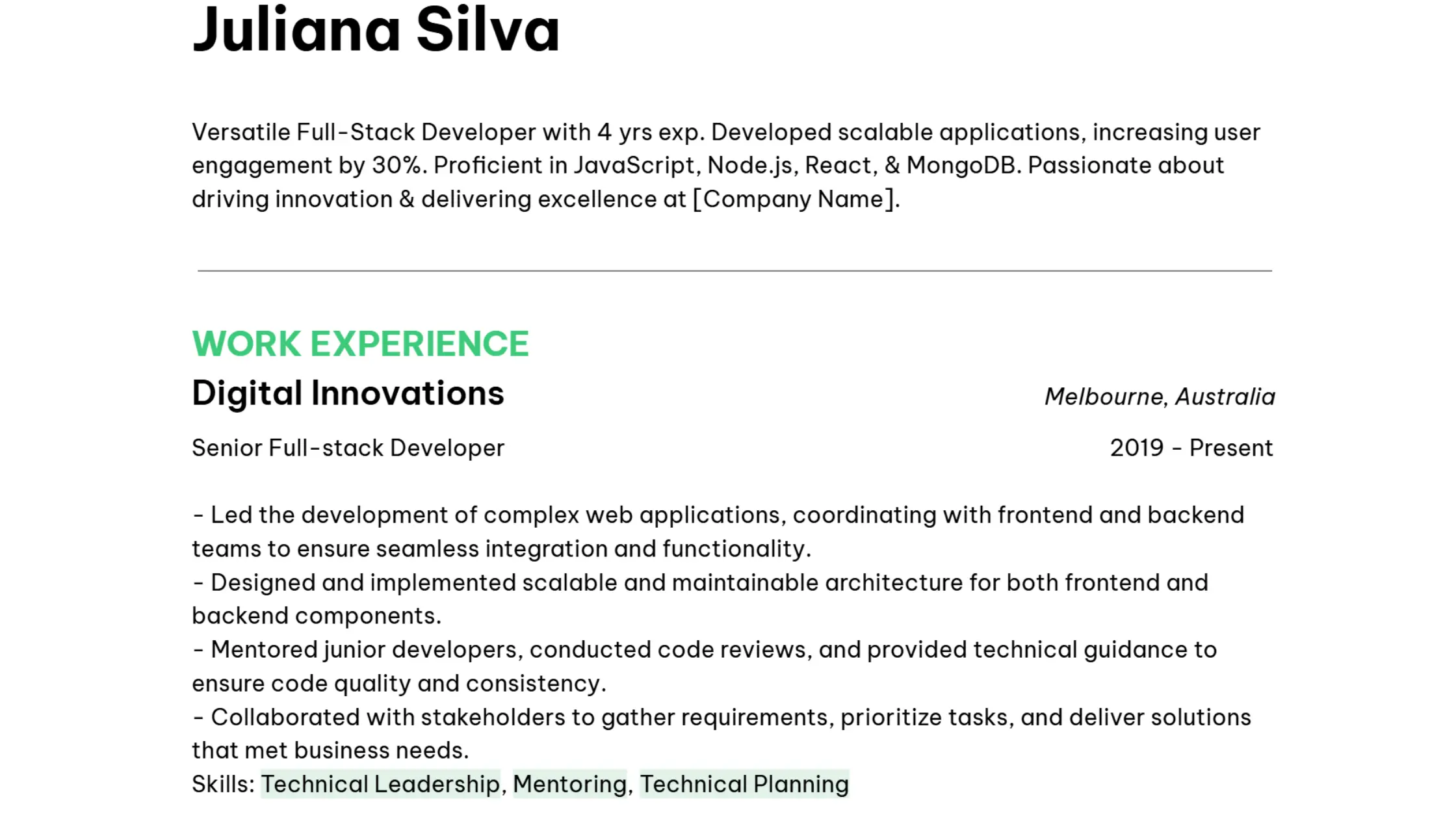
1. Karla – Simplicity and Balanced Legibility
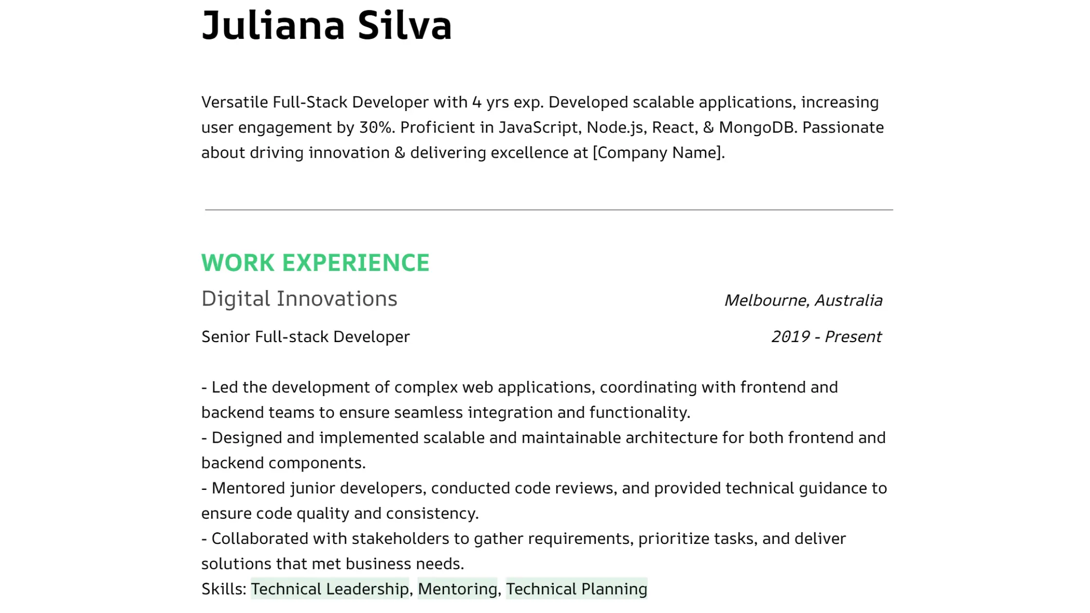
For a resume that balances professionalism with approachability, Karla is an excellent grotesque sans-serif option. We find it to be one of the best fonts for resumes. Its clean design ensures high legibility on screen and at standard resume font sizes (11–12pt), making it a versatile choice for both headings and body text. This is the default typeface for our Rigel theme,
 Karla font is simple and well-balanced
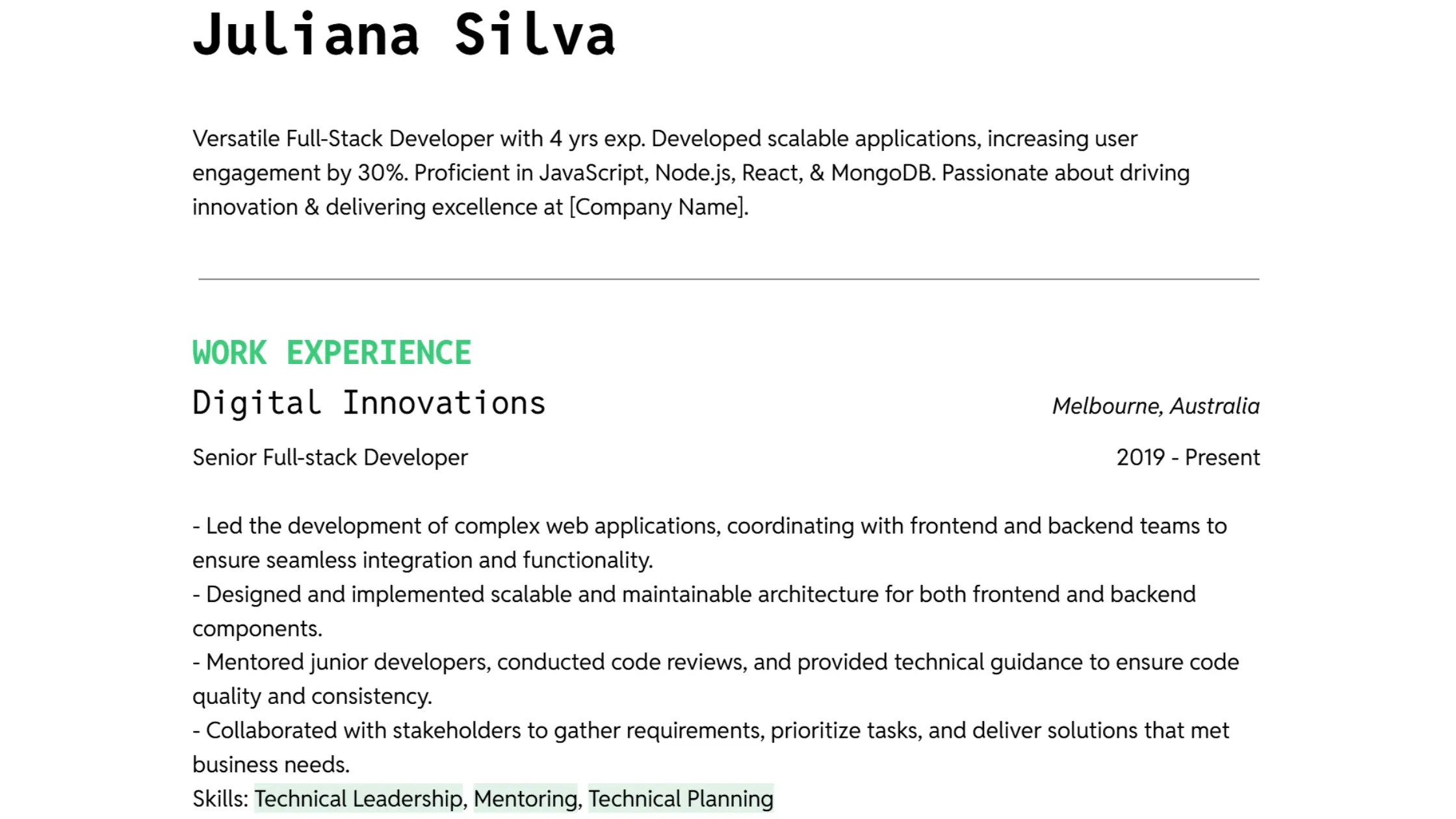
2. Space Grotesk – Modern Clarity and Structured Layout
If conveying a sense of modernity and logical structure is key, particularly for developer and data-focused roles, Space Grotesk is a strong contender. Its geometric yet subtly humanized letterforms create a trustworthy and clear impression when used consistently for both headings and body text, aiding in visual organization.
 Space Grotesk is modern and projects clarity
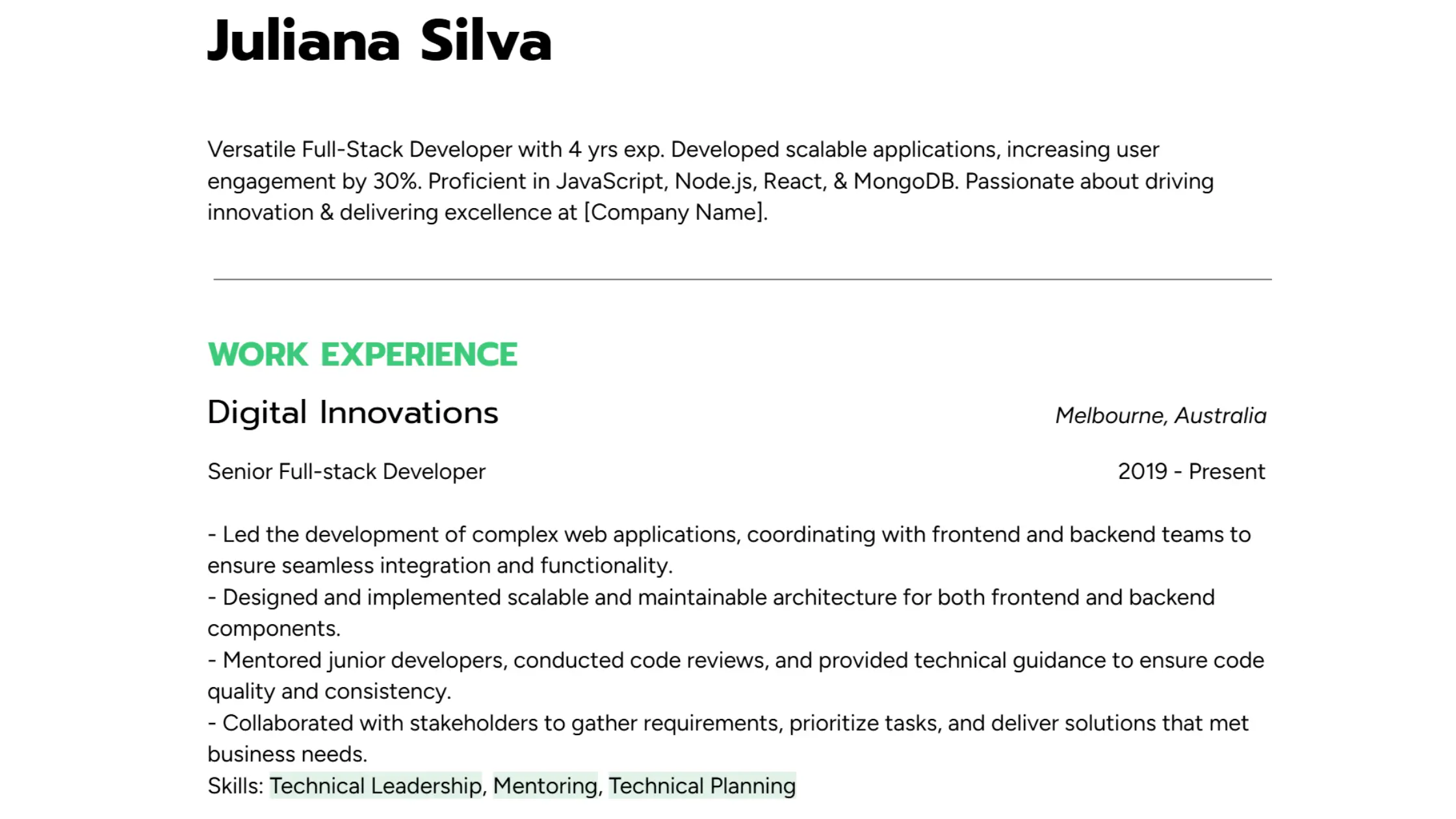
3. Be Vietnam Pro – Versatile Readability for Digital Screens
In today's digital-first recruitment landscape, on-screen readability of tech resumes is paramount. Be Vietnam Pro's clean aesthetic, coupled with a generous x-height and spacing, makes it easy to read on various devices, including mobile. Its wide range of weights also facilitates the creation of a clear visual hierarchy within the document.
 Versatile and readable. Be Vietnam Pro is one of the best fonts for resumes
4. Reddit Mono (headings) + Reddit Sans (body) – Strategic Heading Emphasis with Body Clarity
To create a distinct visual separation and highlight key sections, consider using Reddit Mono for headings. Its monospace style can lend a subtle technical feel to headers. For the main body text, pairing it with the clean and approachable Reddit Sans font ensures readability and avoids the potential legibility issues of using a monospaced font for longer passages. This combination offers a balanced structure.
 Reddit Mono and Reddit Sans make a quirky resume font pairing while keeping your resume professional
5. Prompt (headings) + Figtree (body) – Structured Headings with Approachable Text
For a resume that blends structure with warmth, especially relevant for roles like UX or frontend development, Prompt for headings offers a slightly modern and organized feel. Pairing it with the humanist style of Figtree for the body text softens the overall tone while maintaining clear visual distinction between sections.
 Structured meets warm — Prompt and Figtree make a cool font combo for tech resumes
6. Jetbrains Mono (headings) + Sora (body) – Technical Precision in Headers, Elegant Body Readability
Used in our Lyra theme, this pairing is optimized for developer resumes making it one of the best typefaces for resume. For developer resumes aiming to signal competence and clarity, using JetBrains Mono for headings can introduce a sharp, precise aesthetic (originally designed for code). Combining this with Sora, a screen-friendly and contemporary sans-serif for the body, ensures elegant readability for the main content without the drawbacks of a monospaced body.
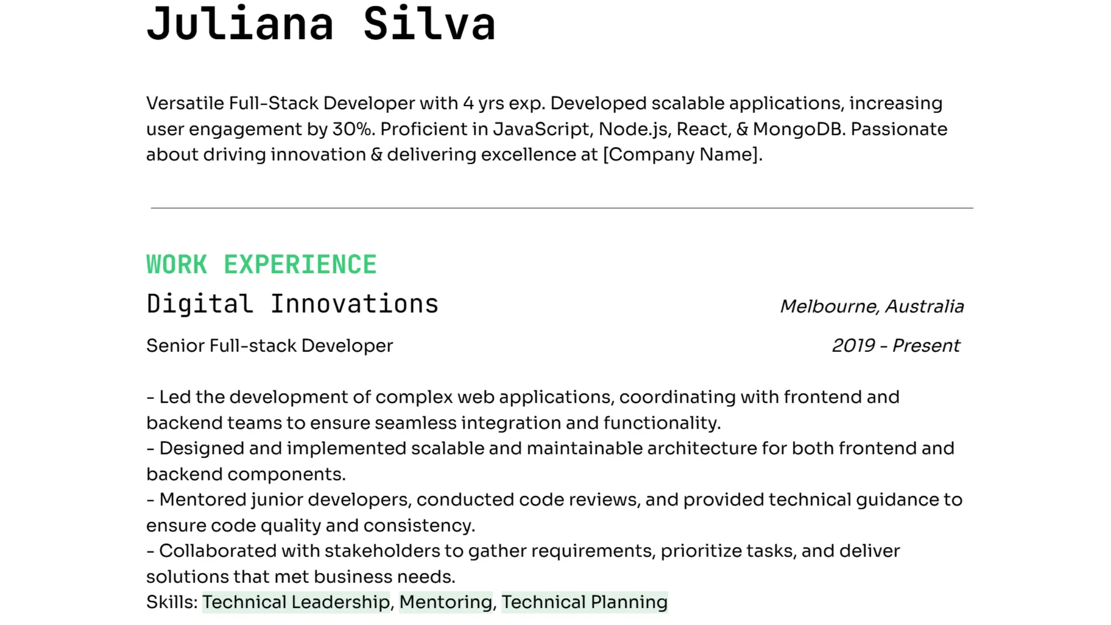 Jetbrains Mono and Sora make a sharp and elegant font combo for tech resumes
7. AR One Sans (headings and body) – Consistent Clarity and Focused Presentation
AR One Sans by Niteesh Yadav is a modern sans-serif font, designed for clarity and focus. Its geometric foundation and clean structure make it ideal for tech resumes where precision and readability are non-negotiable. Using it consistently for both headings and body text creates a thoughtful and modern aesthetic that prioritizes clear communication. When used across your resume, for both headings and body text, it creates a consistent, modern aesthetic that feels thoughtful without being flashy.
For developers applying to engineering or product roles, AR One Sans is a sharp resume font that communicates clarity, precision, and intention - everything a good resume font should be in 2025.
 AR One Sans is clean, modern, and made for focus. It's great for resumes
Bonus: Here are 6 More Unique Google Fonts for Resumes
These are lesser-known fonts that work beautifully in modern tech resumes:
- Barlow Semi Condensed – Space-saving, professional.
- Epilogue – Stylish and minimal; works great on-screen.
- Public Sans – Neutral, versatile, ideal for body text
- Fira Sans – Built for legibility; lovely in coding roles.
- Manrope – Balanced and sophisticated.
- Mulish – Light and airy with solid legibility.
Tip: Consistency with Personal Branding
Match your resume fonts with your cover letter, portfolio, and LinkedIn profile to create consistent personal branding across all application materials.
What’s the Best Font Size for Your Resume?
You can have the perfect font, but if the size is off - too small or too big, it either gets skipped or screams for the wrong reasons. So what’s the sweet spot?
The Goldilocks Rule: Not too big, not too small
Here are some standard font size of resume:
- Body Text: Stick to 10–12 pt. This is the recommended font size for resumes. It's easy to read, screen-friendly, and won’t trigger ATS parsing errors.
- Headings / Section Titles: Go with 13–16 pt. This helps create visual hierarchy without overwhelming the layout.
- Name at the Top: 18–22 pt works well. You want it to stand out, but not scream.
Rule of thumb: If someone has to zoom in or squint, your resume font and size need a rethink.
Resume Font Size for Digital Viewing
Tech recruiters rarely print resumes anymore. Most read them on:
- Laptops
- 13” MacBooks
- Split screens
- Even mobile
So, your resume font size should be screen-optimized. Fonts at 11 pt are particularly great across devices.
Resume Font and Size for One-Pagers
If you're trying to squeeze everything onto a single page (especially for mid-level tech roles), resist the urge to drop down to 9 pt. Instead:
- Cut fluff from job descriptions
- Use 1-2 sentences max per bullet point
- Leave enough white space
Cramming is not a flex, it’s a red flag.
TL;DR: Fonts and Size for Resume – Quick Guide
| Font Choices | Recommended Font Size |
|---|---|
| Karla (both headings and body) | Headings: 14-16 pt |
| Space Grotesk (both headings and body) | Body Text: 10.5-12 pt |
| Be Vietnam Pro (both headings and body) | Margins: 0.5-1 inch |
| Reddit Mono (headings) + Reddit Sans (body) | |
| Prompt (headings) + Figtree (body) | |
| Jetbrains Mono (headings) + Sora (body) (Lyra theme) | |
| AR One Sans (both headings and body) |
Choose the one that fits your personality and the job you’re after, and your resume will do the rest.
Create Visual Hierarchy with Fonts That Guide the Eye
You’ve got great content. Now it’s time to make it scannable. Recruiters don’t read every word. They scan. So your resume needs a visual hierarchy, a system that subtly guides the reader’s eye to the important bits.
Use Font Weight and Size Strategically
Think of your resume like a UI layout:
- Bold = headers
- Regular = body text
- Italic or light = subtle details (like dates, locations)
This keeps things clean, readable, and easy to follow.
Use Font Differences to Signal Content Type
- Job titles: semi-bold or bold
- Companies: regular weight
- Dates: smaller, lighter
White Space is Not Empty Space
White space isn’t just empty . It’s the breathing room your resume needs. It’s what lets each section stand out and makes your content easy to digest. When you group similar items together and leave space between them, you’re guiding the reader’s eyes smoothly down the page.
Minimalism is in trend, especially for tech resumes. By using consistent fonts like Karla for headings and body, along with well-thought-out spacing, your resume doesn’t just look clean. It feels organized. This subtle, yet powerful strategy creates clear boundaries between sections, so your skills, experience, and achievements get the focus they deserve.
Your Font Is Your First Impression
Choosing the best resume fonts and size may seem like a small decision, but it plays a big role in your overall presentation.
The best resume fonts in 2025 are:
- Readable
- Modern
- Intentional
If navigating font choices feels overwhelming, don't worry. We’ve got you covered. With Resumey.Pro, creating a recruiter-approved ATS-friendly resume is simple, so you can focus on what truly matters: landing your dream job.
Let Your Resume Speak for You
One of the biggest advantages of using Resumey.Pro is that we remove the guesswork from resume design. Our platform ensures proper alignment, spacing, and hierarchy - key elements that hiring managers value in a well-crafted resume. By leveraging our professionally optimized templates, you can save hours of formatting time and focus on crafting compelling content.
Thousands of job seekers have already experienced the benefits of using Resumey.Pro to land interviews. From students to seasoned professionals, users rave about how easy it is to create resumes that stand out with little effort.
"I was invited to an interview based on my Resumey.Pro resume! It really saved me time and helped me present myself professionally." – Jasper S.
"The formatting is taken care of, so I could dedicate maximum attention to my content. This is a huge plus!" – Harsha K.
Try Resumey.Pro today and see how it transforms your job search journey